Current mission: finish filling in the OTDs
Template talk:Ratings
template looks ugly and disorganized[edit source]
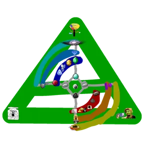
IMO this template looks ugly and disorganized. i made a concept for a redesign
gray is the primary ratings, blue and red are the secondary ratings, light blue and orange are tertiary cyan and yellow are quarternary, green is quinary (SNCA)
what do you think?
Perpetualchange (talk) 17:59, 17 November 2025 (UTC)
- It looks gemmy but a little confusing, like there should be a clear axis of bad to good and I can't seem to find one. Cobblestone (talk) 21:14, 17 November 2025 (UTC)
- from north (not the user) its gemmy, from south its coal. Perpetualchange (talk) 15:33, 18 November 2025 (UTC)
- i would remove the gradient (it's an eyesore) and replace it with background colors for each mineral, while removing the gem and coal text from the header. also it has quite a lot of padding North (talk) 21:17, 17 November 2025 (UTC)

- >tfw we've yet to change this ugly ass template
- Perpetualchange (talk) 03:22, 22 November 2025 (UTC)
Antimatter (talk) I think it should look like this, looks much better than making it take an entire screen on mobile for no reason
- fix the table based one we currently have to work as it should on mobile, the one below doesn't look great North (talk) 01:59, 25 November 2025 (UTC)
| Mineral rating system:
Other ratings: |
why is ijak there[edit source]
i get the reasoning for all the other ratings, ID'd/filled/vantapurple/topaz all make sense, but what is ijak supposed to represent? i dont think theres a single rating related to ijak and even if there was any it isnt even on ijak's own page FitchBaggot (talk) 02:41, 4 January 2026 (UTC)
